
UX Case Study: Atwater Goods
Client: Atwater Goods
Challenge: Trying to create a user experience that is both a men's fashion magazine and an ecommerce platform. The challenge is that the content of the magazine portion of the website needed to not feel like a giant advertisement for the ecommerce portion of the website.

Competitive Analysis
One of our developer's was responsible for doing a competitive analysis of similar brands in the client's sector. I used her research findings to also serve as a framework and starting point for relevant usability patterns.
I also did additional research and found over 20 sites that would serve as inspiration for this project. I compiled my findings into an in-depth Creative Brief
Site Map & Information Architecture
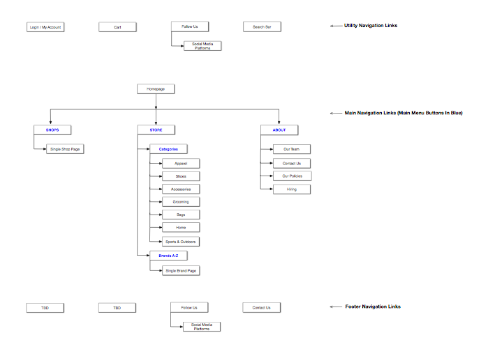
This site was not overly complex in terms of mass amounts of content. Rather, the bigger challenge was the navigation and usability patterns of the site. The client wanted featured stories to have a feeling like they were the endpoints of a supermarket aisle. Those featured stories would take you deeper into the specific magazine's theme of the week.
Wireframes
The main deliverable of this project were wireframes and prototypes. I used my favorite tool Sketch.app to create static wireframes to clarify and organize layout, content-hierarchy, and site navigation.
I worked closely with developers who created interactive HTML/CSS/Javascript prototypes to demonstrate functionality of the various UX components. Here are some of the wireframes I created.


This design needed to be responsive, but it also required a lot of Javascript functionality because the client wanted the site to look & feel like a very unique experience. You can see my post-it-notes used for communicating with the client, project managers and developers.
There were lots of modular components such as collapsable/expandable products and grids that could increase in size depending on how many products a page contained.
There were also several navigation patterns that needed to be activated on scroll so the user would intuitively know where they were located within the site.
This project easily could have become a usability nightmare because it was really trying to push the envelope.
It turned into one of the most fun projects I've ever worked on because of how collaborative our team was in iterating on user experience ideas.
The developers quickly worked in Bootstrap, as I designed in Sketch. The client was closely involved and we were able to finalize mockups that all parties were very satisfied with.
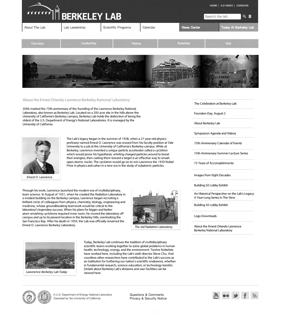
UX Case Study: Lawerence Berkeley Labs
Client: Lawerence Berkeley Labs
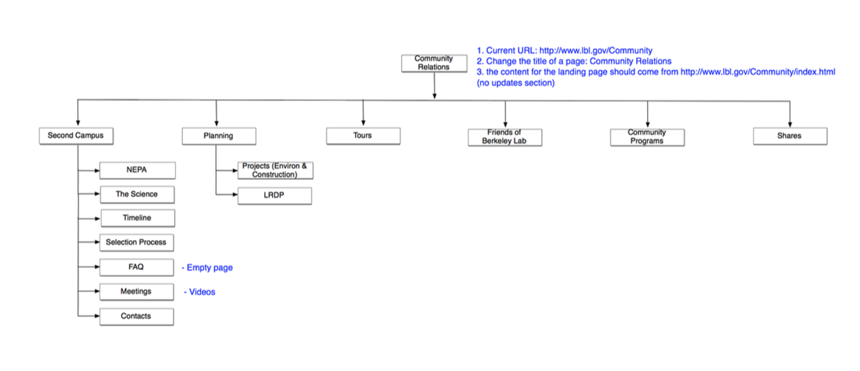
Challenge: Lawerence Berkeley Labs was founded in 1931 and has produced 13 Nobel Prize winners. Due to it's rich history, the labs have a lot of legacy content. They came to us wanting to redesign their site and make it responsive, but the major challenge in this project had to do with information architecture.

Sitemap & Information Architecture
The project manager, developers and myself worked together to simplify and reduce the layers of navigation. The project manager put together a sitemap as I worked alongside creating wireframes to ensure our page and category organizational structure was working in unison with the sitemap
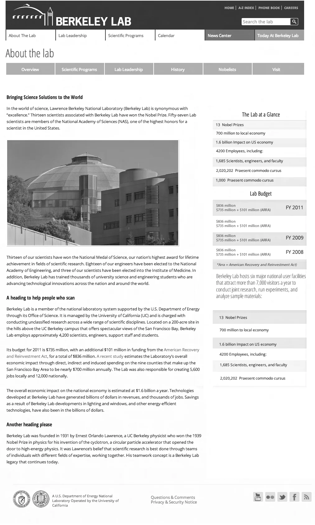
Wireframes
Creating multiple levels of navigation and easy to use sidebar areas was an important component of this project. Over the course of time, many people end up needing to become content-editors. The site was to be powered by WordPress and I created wireframes for sidebar modules that would be easy to update by the client. Our developers were highly skilled in creating advanced custom fields to make content management a breeze for clients.
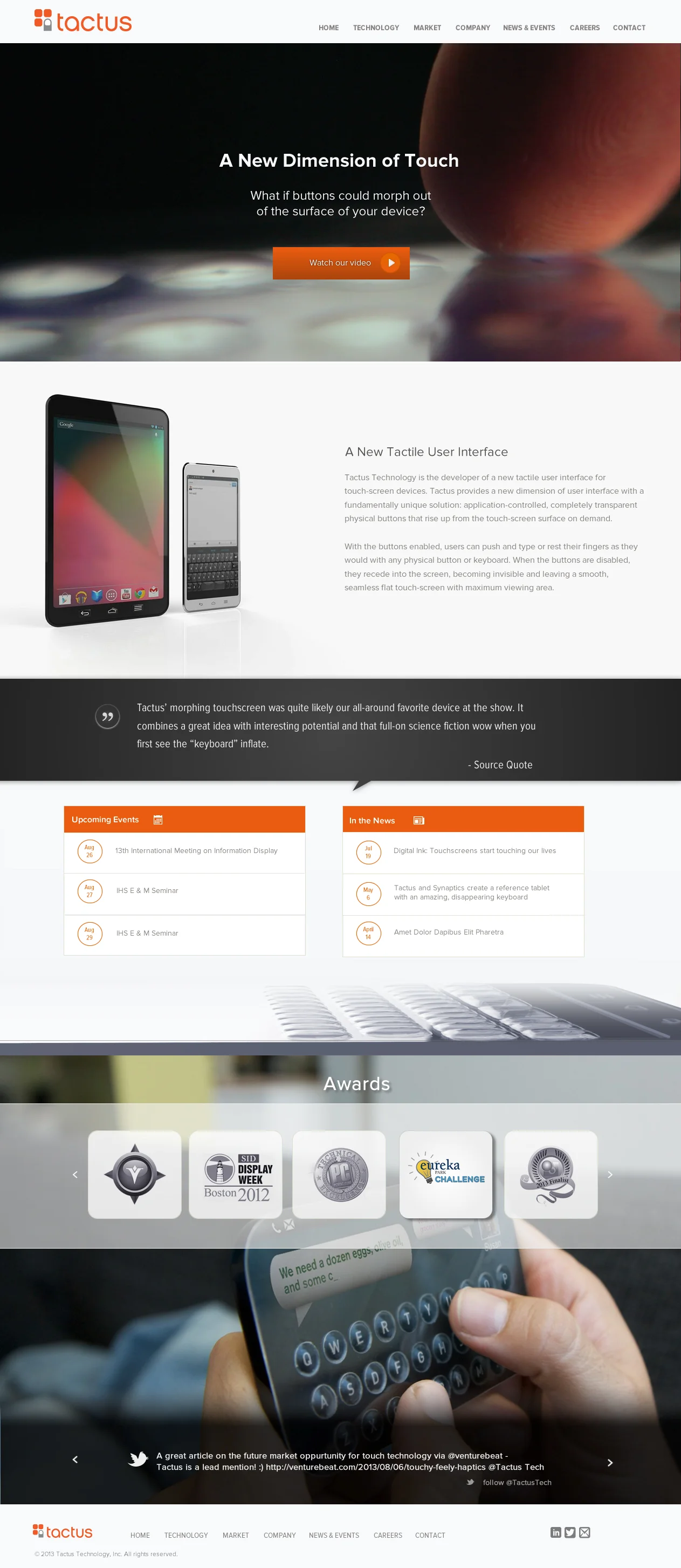
UX Case Study #3: Tactus Technology
Client: Tactus Technology
Challenge: Tactus Technology created a mindbending technology which enables a keyboard to literally morph off the surface of a touch screen device. They showed us a prototype during the kickoff meeting and I felt like I was witnessing some sort of sci-fi movie right in front of me. Our challenge with this project was to create a website that was dynamic and engaging, like their technology.


User Personas
Tactus Technology went above and beyond as clients. We routinely gave clients a Creative Questionnaire to fill out. This document would help me put together Creative Briefs. When we got this questionnaire back they had also created User Personas with pictures and all. This greatly helped us clarify the audience for the website.
Wireframes and Mockups
The homepage for this site had a lot of dynamic components that needed to be mocked up. The main hero image featured a button which linked to a video demonstrating the client's product in action.
There was a slideshow with quotes, a live Twitter slider, and a dynamic events listing. Here's a rough mockup of the homepage to give you a better sense of the proiect (I didn't hold on to these wireframes or I'd share them instead).
Hopefully these UX case studies have given you a little bit of background into my user experience design process. I'm constantly striving to dig deeper into the amazing UX community while also refining and honing my UI design skills.